In the hyper-visual landscape of global luxury, a brand’s power is increasingly measured by its ability to communicate without saying a single word. While logos once served as the primary guardians of authenticity, a more primal code has emerged as the ultimate signifier of prestige: signature colors.
From the visceral “Rosso” of Valentino to the protected “Robin’s Egg Blue” of Tiffany & Co., these tints are far more than mere aesthetic choices. They are calculated managerial assets designed to trigger immediate emotional responses and bypass our rational scrutiny.

Identify as a Competitive Moat
In an era defined by “brand saturation,” a signature color functions as a strategic moat. When a color is successfully codified, it achieves Brand Fluency, which is the cognitive ease with which a consumer identifies a brand with minimal effort. This “visual heritage” makes it nearly impossible for competitors to occupy the same chromatic space without appearing derivatives.
The Biographies of Color: From Operatic Reds to Accidental Oranges
I came to learn that in the world of luxury management, a signature color is never a mere byproduct of design, but a carefully calculated managerial asset that anchors a brand’s heritage in a state perceived by the audience as timeless. To understand how a simple tint becomes an international icon, we must look at the strategic alchemy of the houses that mastered them.
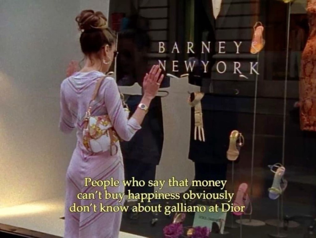
Valentino: The Pulse of Italian Glamour

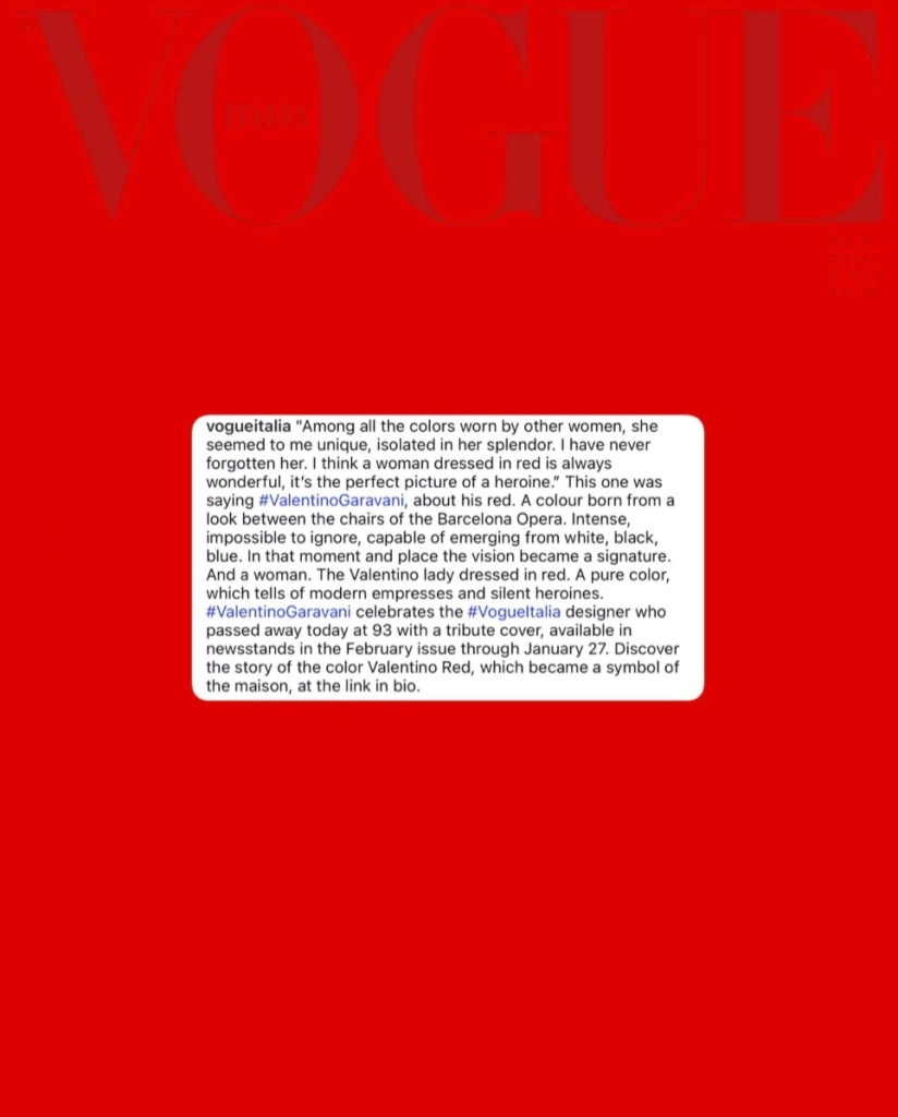
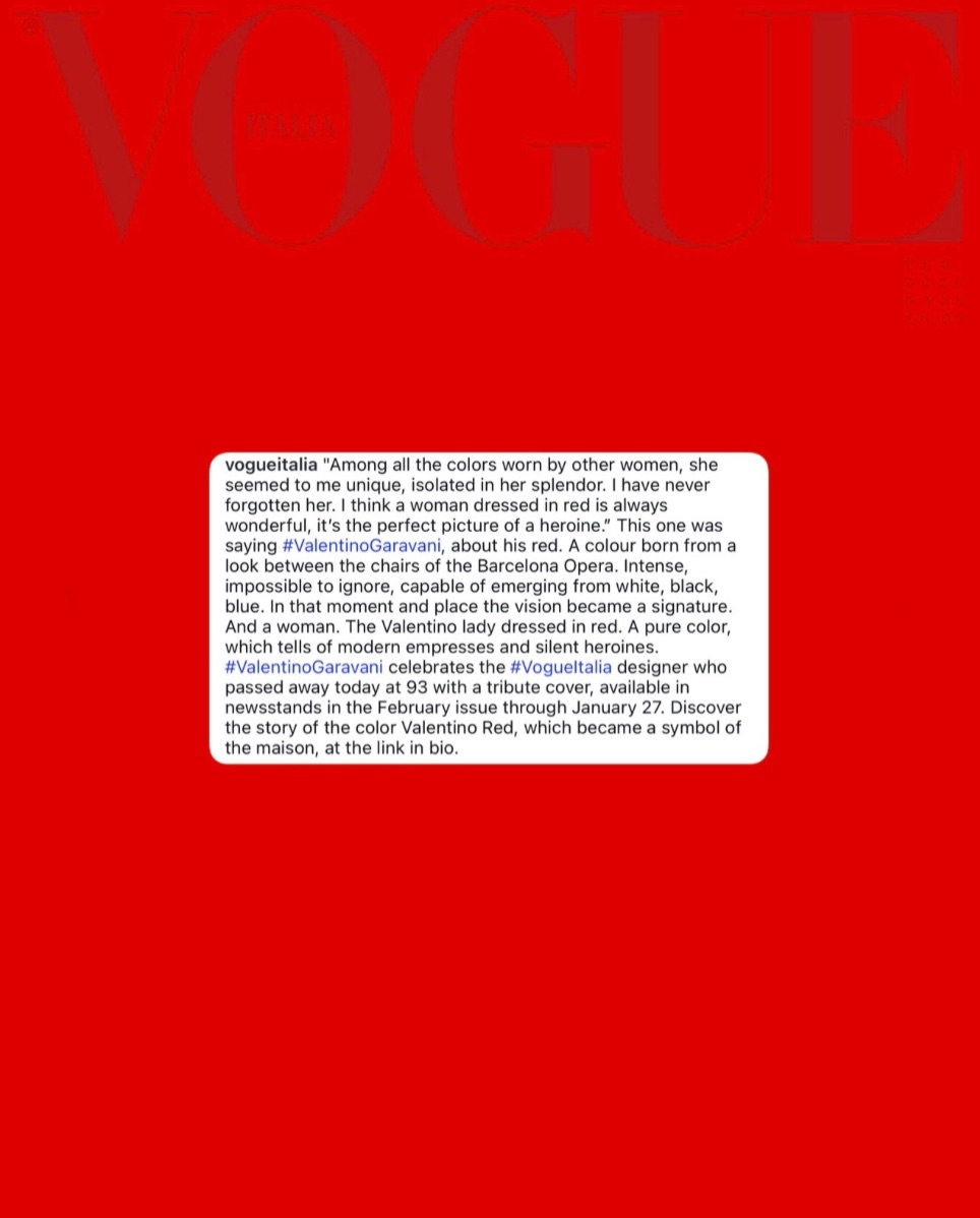
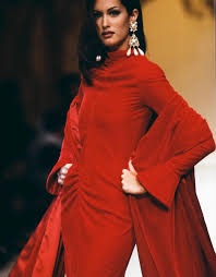
The story of Valentino Red begins not in a boardroom, but at the Barcelona Opera House, where a young Valentino Garavani was so captivated by the dress a mysterious woman was wearing that he sought to bottle that energy for his own Maison.
This hue is a precise, scientific blend—100% magenta, 100% yellow, and 10% black—that has served as the brand’s facet for over six decades. As a matter of fact, by closing every runway show with a “Red Dress” finale, the brand transitioned the color from a fleeting seasonal trend into a Permanent Identity Code.
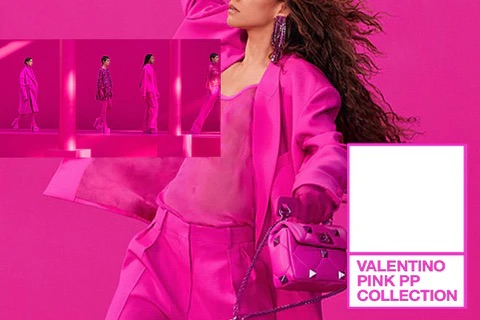
Even as creative directors change, the red remains an immutable anchor. When Pierpaolo Piccioli introduced the viral “Pink PP” collection, it wasn’t an abandonment of heritage, but a strategic re-coding that proved the brand owned the very concept of monochromatic dominance before returning to a digitally-optimized “Rosso” under Alessandro Michele.
Tiffany & Co: The Shield of Recognition

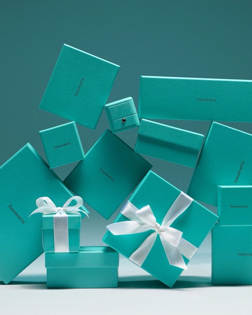
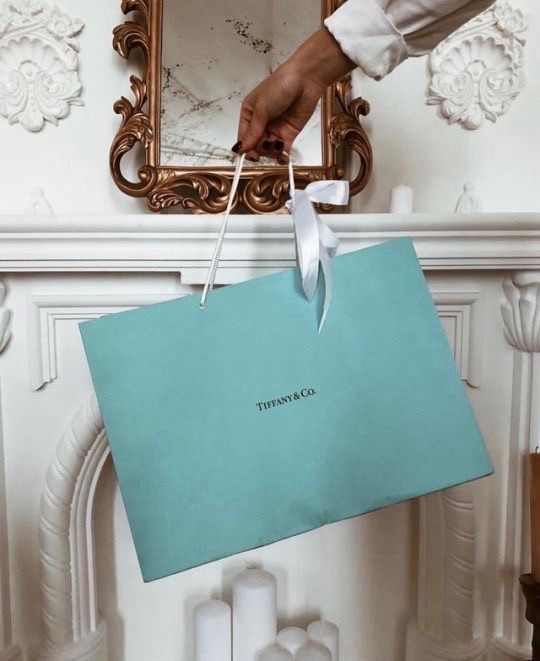
While Valentino uses color as a passionate anchor, Tiffany & Co. uses its “1837 Blue” as a literal and psychological shield. Named after the year of the brand’s founding, this high-luminance turquoise was originally selected for the cover of the “Blue Book” in 1845.
Interestingly, the color was never intended for the jewelry itself, but for the packaging, creating a Pavlovian response where the mere sight of a blue box triggers a dopamine release before the lid is even lifted.
From a managerial perspective, this is the pinnacle of Brand Fluency. In fact, by securing Trade Dress protection, Tiffany has created a “legal monopoly,” ensuring that the emotional value of the unboxing ritual is never diluted by market imitation. On social media, the brand’s “No-Logo” strategy allows a simple square of 1837 Blue to carry the entire weight of a 180-year heritage without a single word of text.
Hermès: The Triumph of the Unexpected

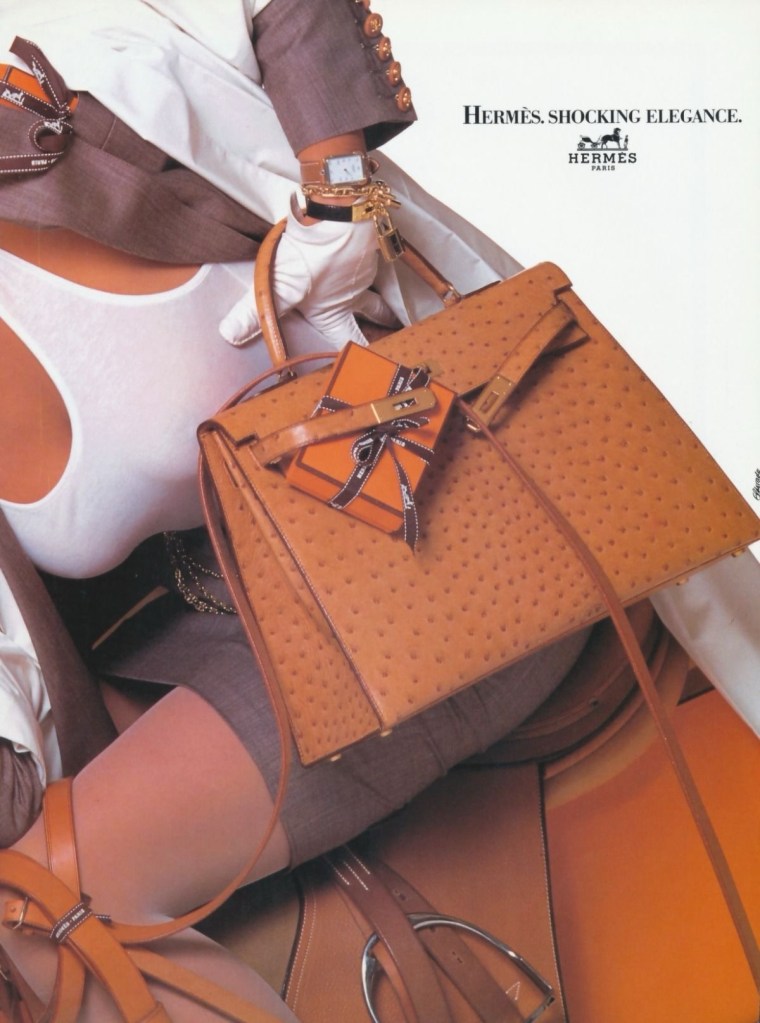

Perhaps the most poetic of the three is Hermès Orange, or “Orange H,” a signature born entirely from a historical accident. In fact, before the 1940s, the house used cream-colored packaging for their products. However, when Nazi-occupied Paris faced severe material shortages in 1942, the only paperboard available to Émile-Maurice Hermès was a vibrant, “unwanted” orange.
Brilliantly, rather than pausing production, the house embraced the tint, eventually re-encoding what was once a reluctant necessity into a symbol of the “Indomitable European Spirit”. Today, this orange radiates a psychology of warmth and equestrian optimism. Because it is a “bespoke” property not listed in standard Pantone systems, it remains notoriously difficult for counterfeiters to replicate, acting as a functional barrier to entry and a driver of resale value in the secondary market.
The “Scroll-Stop” Factor: Capturing the Attention Economy
In our modern, hyper-accelerated digital landscape, human focus has become the world’s rarest commodity. Brands are no longer simply competing for a share of the consumer’s wallet, but they are engaged in a high-stakes battle for cognitive bandwidth. This is where the signature color truly shines as a “scroll-stop” factor.
On platforms like Instagram or TikTok, where users swipe through content at lightning speed, a vivid splash of brand-coded color provides instant recognition even when a logo is too small or blurry to read. By saturating physical pop-up shops and digital campaigns in a single, unmistakable hue, luxury houses achieve brand fluency.
This strategy effectively turns every customer into a brand ambassador; each shared photo of a monochromatic space becomes a “passive advertisement” that reinforces the brand’s identity across global networks without a single cent of additional marketing spend.
Chromatic Guardrails: The Manager’s Strategy for Continuity
For a luxury manager, one of the most delicate challenges is navigating the Creative Director’s Dilemma: the inherent tension between a new designer’s desire to innovate and the brand’s need to preserve its sacred heritage.
Signature colors serve as the essential “chromatic guardrails” for this innovation. While silhouettes, materials, and artistic visions may evolve, the color remains an immutable anchor that ensures a brand does not lose its soul during a transition of power. Moreover, this consistency ensures that brand equity is tied to a permanent visual asset rather than the personality of a single designer, protecting the house’s long-term market value.
Strategic Alchemy: When Branding Becomes a Feeling
Ultimately, the management of a signature color is a form of “strategic alchemy” that balances the quantitative, such as legal trademarks and supply chain precision, with the qualitative power of emotion and intuition.
By mastering these codes, luxury brands ensure that their identity is not just something a consumer sees, but something they feel, hence transforming a simple aesthetic choice into a powerful, intangible financial asset.

Leave a comment